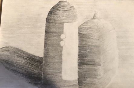
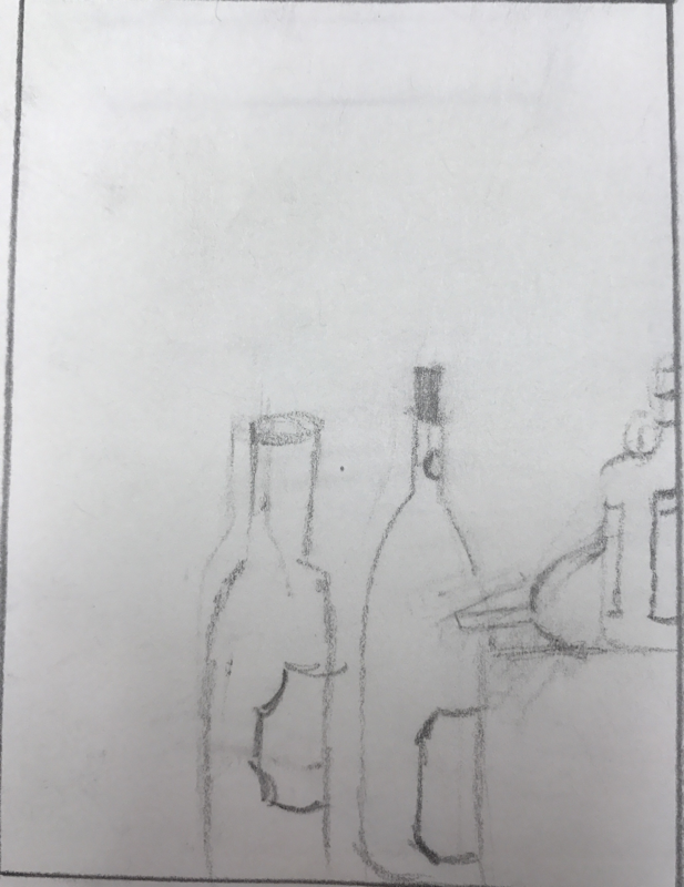
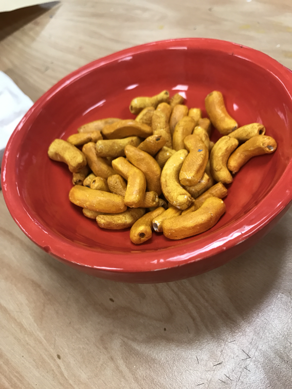
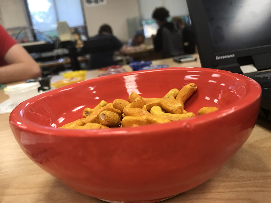
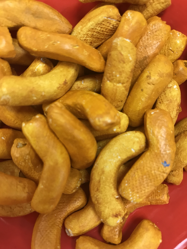
Clay food
Describe the craftsmanship of your sculpture. (Is it neat and well executed?)
My craftsmanship is very well executed. and very neat. especially when it come to the bowl. The bowl gives this peice of art the special touch that makes it look well and neat.
What was the most difficult part of this project?
The most difficult part of this project was definitely trying to the get the noodles relatively the same size and shape that they needed to be to look macaroni.
Did your color choices work together harmoniously?
I think my colors are the right colors for the project. I feel I could've gotten a better cheesy color but I was pretty close. The bowl I chose a red color because I think the red compliments the yellow nicely.
Is your sculpture interesting from all views?
I believe my sculpture is interested from all view because I didn't just work on one side of the noodle or bowl. I made each noodle individually so that from all views it looked like an actual bowl of macaroni.
Describe the differences in constructing a sculpture and doing something 2D.
The difference is having to deal with all sides then just a couple. also another difference is creating the texture instead of just drawing it is huge difference
How did you create textures in your sculpture?
The way I incorporated texture into my sculpture was by smoothing out both the bowl and the macaroni noodles. I would wet my finger and run it around on the noodle to get the noodle to the smoothness I needed. For the bowl I spun it to make sure it was smooth and round.
Does your sculpture look like the actual food? How did you accomplish this?
Yes, my sculpture does look like actual food. I did this by making sure the texture, color, and size were as close to the actual macaroni noodles.
What would you do differently if you were to do this project again?
I would probably change the color to a brighter yellow than a really deep yellow. One other thing I would change is focusing on how neat the noodles looked.
- Describe the differences in constructing a sculpture and doing something 2D.
Describe the craftsmanship of your sculpture. (Is it neat and well executed?)
My craftsmanship is very well executed. and very neat. especially when it come to the bowl. The bowl gives this peice of art the special touch that makes it look well and neat.
What was the most difficult part of this project?
The most difficult part of this project was definitely trying to the get the noodles relatively the same size and shape that they needed to be to look macaroni.
Did your color choices work together harmoniously?
I think my colors are the right colors for the project. I feel I could've gotten a better cheesy color but I was pretty close. The bowl I chose a red color because I think the red compliments the yellow nicely.
Is your sculpture interesting from all views?
I believe my sculpture is interested from all view because I didn't just work on one side of the noodle or bowl. I made each noodle individually so that from all views it looked like an actual bowl of macaroni.
Describe the differences in constructing a sculpture and doing something 2D.
The difference is having to deal with all sides then just a couple. also another difference is creating the texture instead of just drawing it is huge difference
How did you create textures in your sculpture?
The way I incorporated texture into my sculpture was by smoothing out both the bowl and the macaroni noodles. I would wet my finger and run it around on the noodle to get the noodle to the smoothness I needed. For the bowl I spun it to make sure it was smooth and round.
Does your sculpture look like the actual food? How did you accomplish this?
Yes, my sculpture does look like actual food. I did this by making sure the texture, color, and size were as close to the actual macaroni noodles.
What would you do differently if you were to do this project again?
I would probably change the color to a brighter yellow than a really deep yellow. One other thing I would change is focusing on how neat the noodles looked.
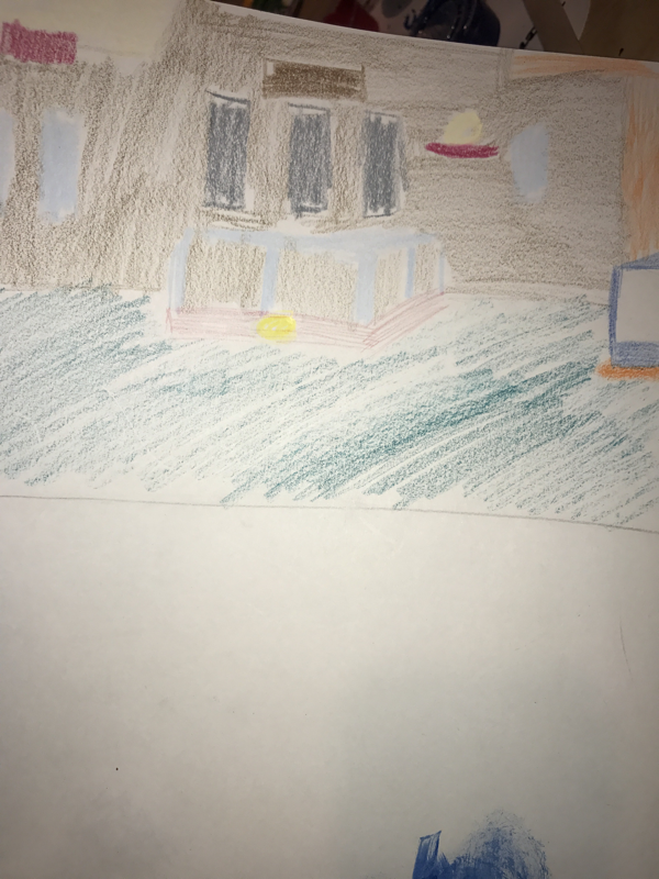
Artist painting
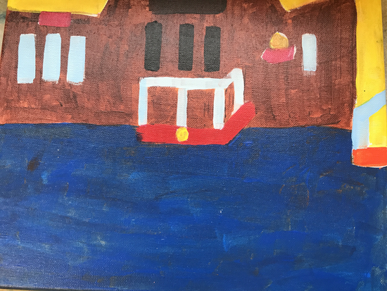
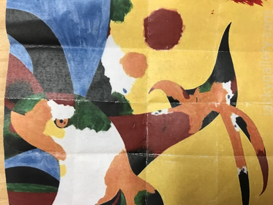
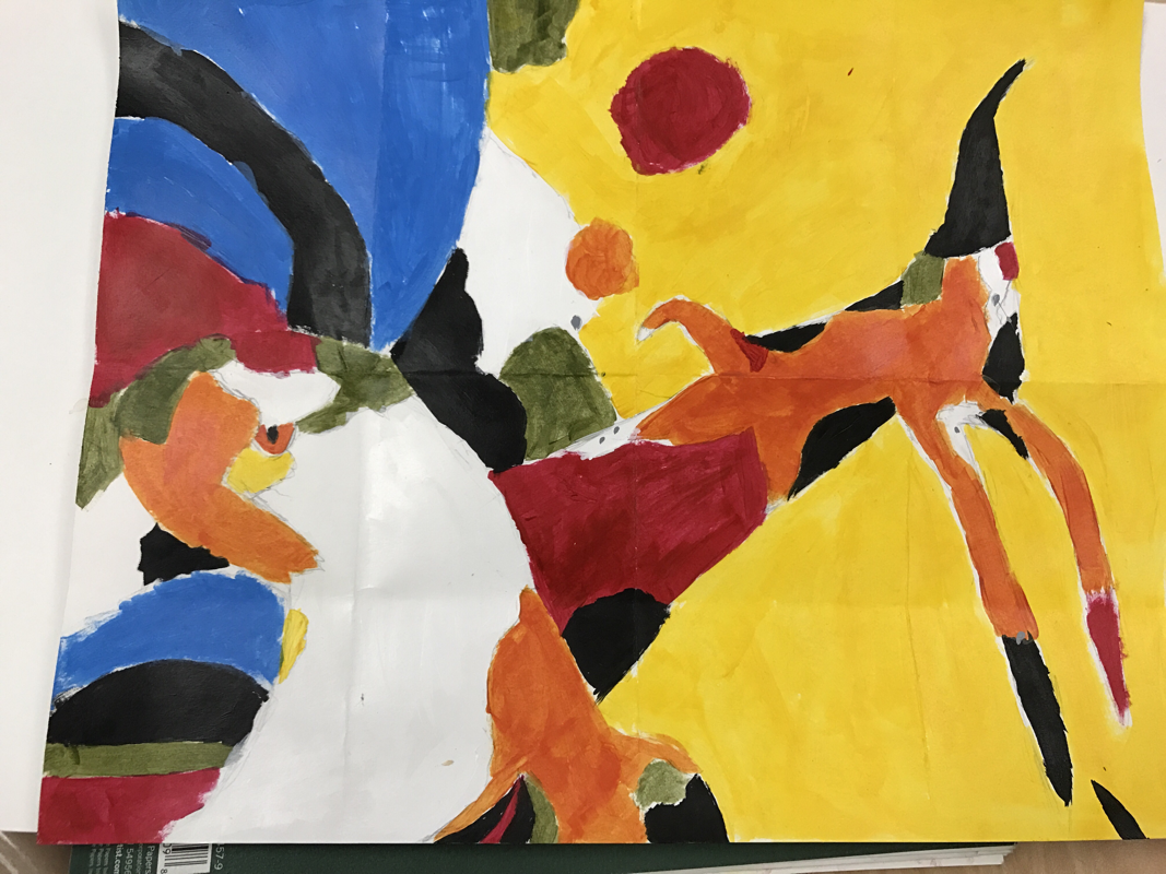
Who was your referenced artist for the painting? Name 4 main ideas you used from your research to create your painting.
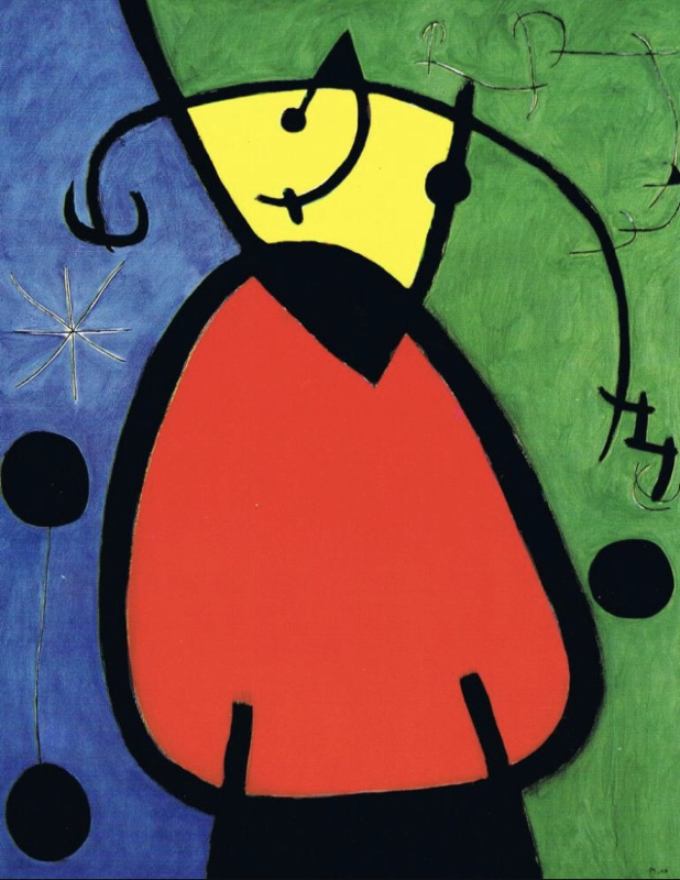
Name- Joan Miro
1- "The Farm"
2- "Spanish dancer"
3- "The Tilled Field"
Describe the craftsmanship of your painting. (Is it neat and well executed?)
The craftsman ship I used was neat, in relations with my artist. I used a limited palette of bold distinct colors throughout most of the painting.
What was the most difficult part of this project?
The most difficult part was trying to make it in the style of Joan Miro. Having it look abstract but still recognizable to what I was painting.
Describe your color choices and how they reflect the work of your chosen artist?
I chose very vibrant bold colors for most of the painting because it applied to the style of Joan Miro. I used a bright orange, yellow, and blue along with a deep blue and a limited brown.
Describe how the style of your landscape reflects your chosen artist.
The style of the landscape reflects Miro by the way I mixed colors. Also the way I used a limited palette for some of the colors.
What do you think your chosen artist would say if he or she could see your painting today
uhm. They would say "good attempt". He would also say that I did a good job reflecting his work. And i used his techniques fairly well.
What would you do differently if you were to do this project again?
I would choose a different name, so that it would become easier and fit my artistic ability
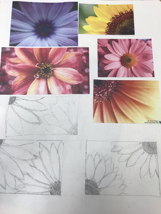
Artist research project
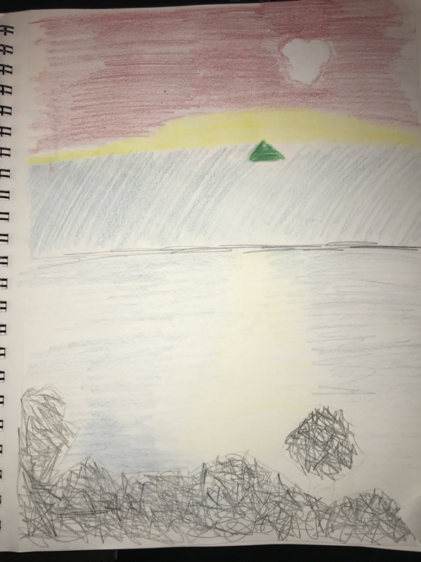
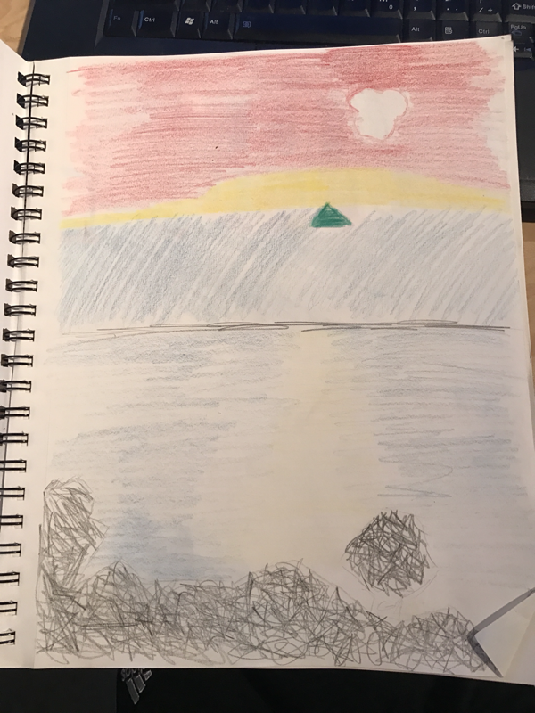
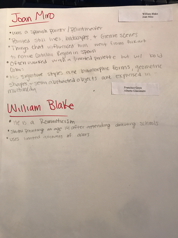
Here are my 3 compositional sketches along with my 2 research paragraphs on 2 different artist.
Color wheel
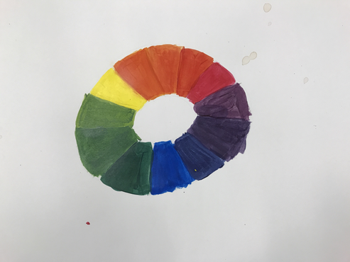
I chose to do a color wheel in the shape of a donut.
Painting Section
I got a painting section from Joan miro. It was fun but challenging
Value painting chart
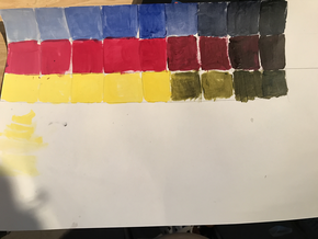
These are my value charts. I chose to do just the primary colors.
Prisma final
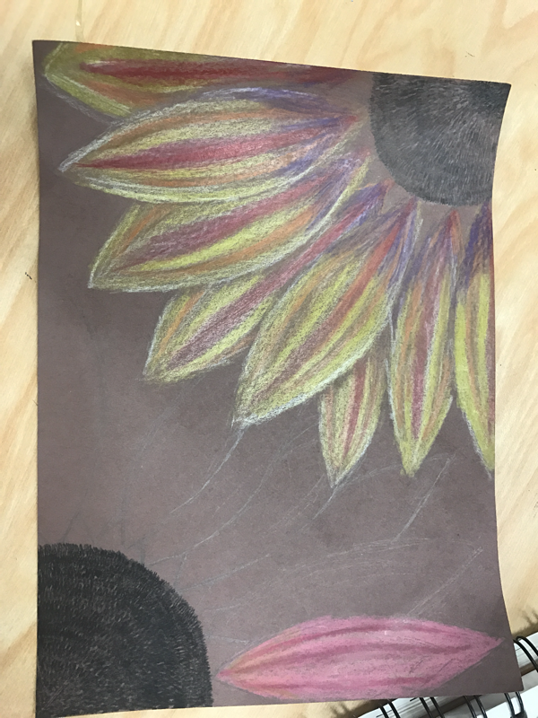
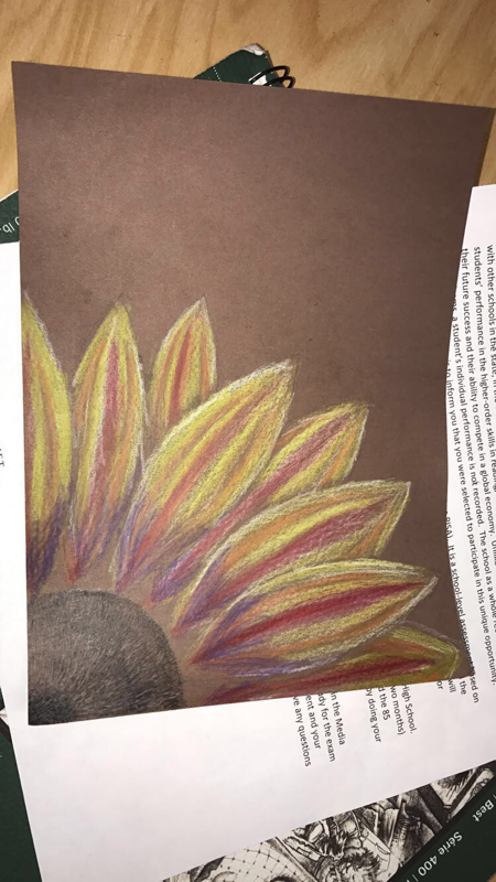
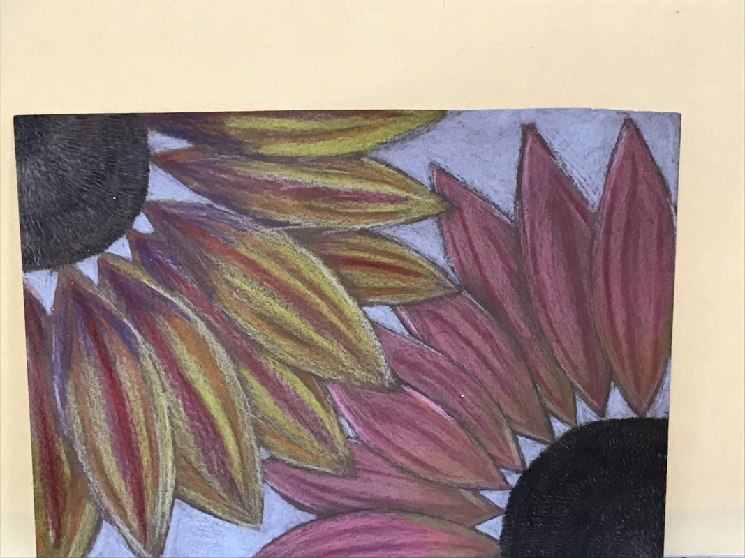
Describe the craftsmanship of your drawing. (Is it neat and well executed?)
I think the craftsmanship of the drawing is very nice and put together. I made sure to go slow to make sure everything was neat and well thought out.
Do you think you used a full range of values to create the illusion of depth?
I think I used a good amount of values, but I definitely could have used more value in the petals, along with the center of the flowers.
How do you think you represented the style of the artist Georgia O’ Keeffe?
I represented the style by taking the 2 reference picture I had and taking a small portion of it and zooming in. By drawing my flower up close is how I represented the style of Georgia O'Keeffe.
Describe your choice of colors/color harmonies and how you used them throughout the artwork?
I chose the colors I did because the layering effect to get the color outcome that i wanted. Also near the end of the petals I used complementary colors to show more depth and shading.
How did you create contrast in your drawing?
I used contrast with complementary colors to show contrast near the bottom of the petals. I also showed contrast with putting a light blue backround to have the petals of the flower stand out more.
How did you use textures, highlights and shadows to enhance your artwork?
I used a little bit of texture within the middle part of the flower. Along the sides of the pedals I have small amounts of white to show highlights. And i used darker colors and tan colors to show shading and near the end of the petals.
Describe any difficulties you had creating your drawing and what you could do to improve your drawing?
It was difficult to figure out what colors I should use for shading and to show depth within the petals. I could have spent more time on creating the middle of the flower and having more detail within the middle of the flower.
Water color techniques
water color techniques
water color value chart / practice shapes
This is my water color shapes and chart
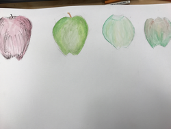
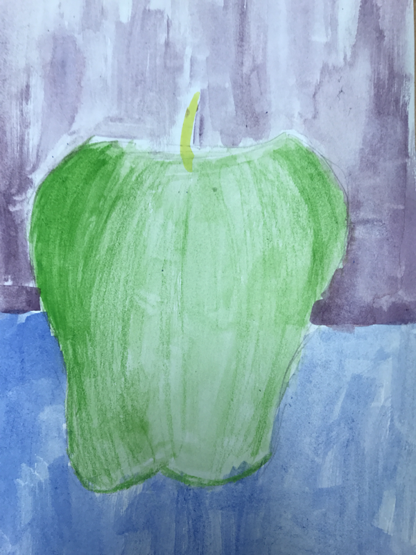
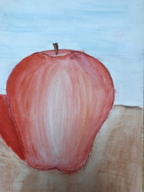
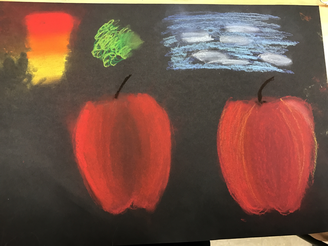
water color apples
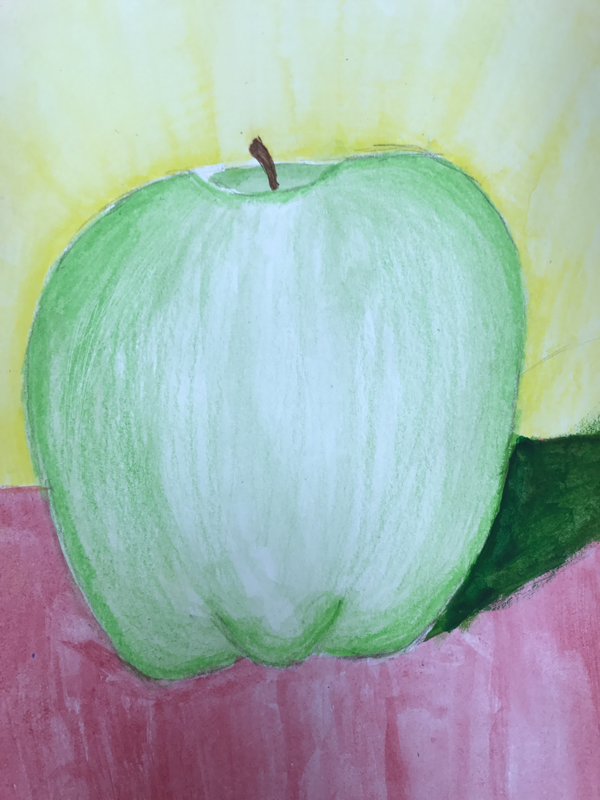
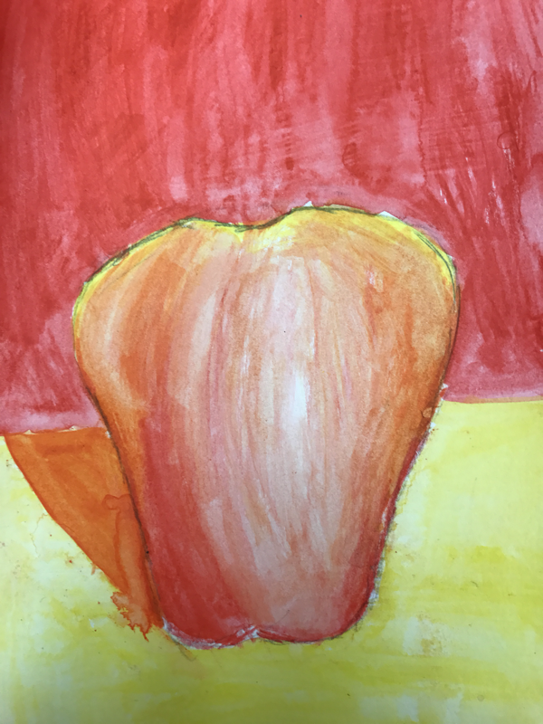
The first apple I did complimentary colors w/ traditional color pencil.
The second apple is used w/ cool colors.
The third apple I used water color pencils.
The fourth apple I used warm colors.
The second apple is used w/ cool colors.
The third apple I used water color pencils.
The fourth apple I used warm colors.
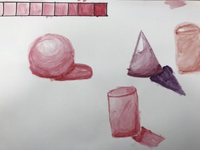
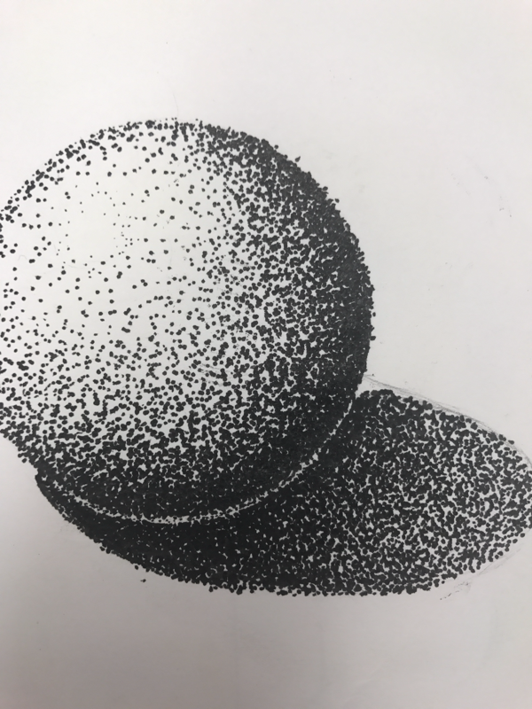
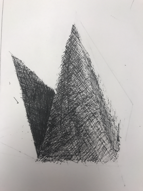
Prisma practice
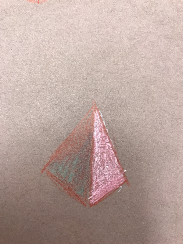
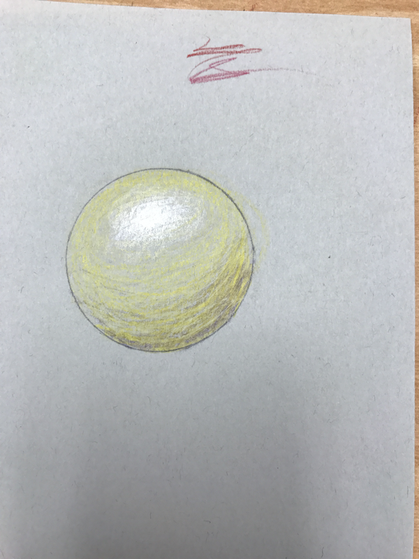
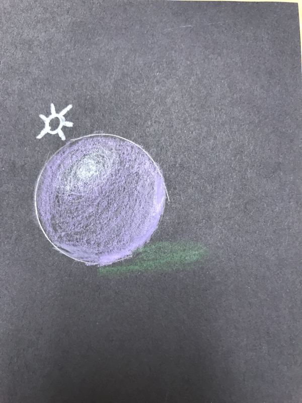
for my practice I did 2 spheres and 1 pyramid
Prisma fruit
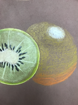
I drew a kiwi and an orange
Pastel practice
this is my pastel practice
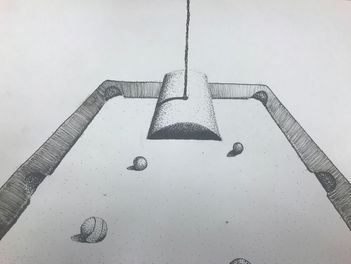
Pen and Ink Final
Discuss your decision on pen and ink techniques. Why you chose to use one or more
The pen and ink techniques I used in my final was mostly stippling but for the border of the pool table I used hatching. I chose to do mostly stippling because i really like the idea of it. I chose the hatching for the sides of the table because i wanted to chose a different texture to pop out and look a little different from the rest of the drawing.
How did you use perspective? Why is perspective important?
The way I used perspective is by having multiple pool balls throughout the table, having the ones by the bottom be bigger than the ones in the far back. Perspective is important because it makes the composition more realistic
How is texture important in your composition?
Texture is important because it makes certain things pop out more than others and really gives a realistic feel to it. I showed this in my composition by using hatching on the sides of the table to make it seem more leathery or wood-like.
Why is value so important in this project?
Value is important in this project because it makes the picture look realistic and 3-D, and without it the picture wouldn't look like what it actually is.
Describe your craftsmanship (How well the project is crafted technically)
I think my composition is crafted well because the picture shows what i want it to show and it looks like a pool table which is good.
If you could recreate your piece what would you do differently to enhance your final outcome?
If I could recreate my composition I would most likely put in more bool balls and also make the balls look neater and focus on their shadowing which would make the drawing look really neat and put together.
When applying the pen and ink techniques why and how is it important to make sure you understand the concepts taught in class?
Understanding the concepts of the techniques is important because the shading and values would be correct and look realistic than if you didn't understand them the shading would not be right and the drawing wouldn't be at its full potential
As a growing artist how do you think what you have learned will guide and better your future projects.
I understand shading more and where the light spots should be. This will help me with every other drawing that deals with value.
Pen and Ink
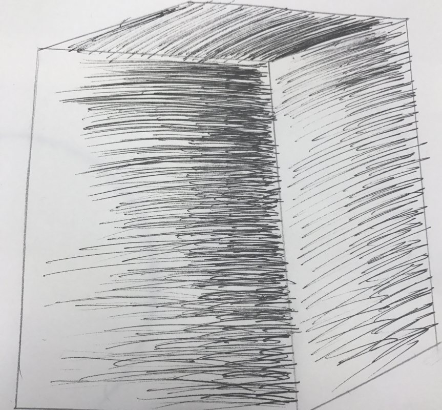
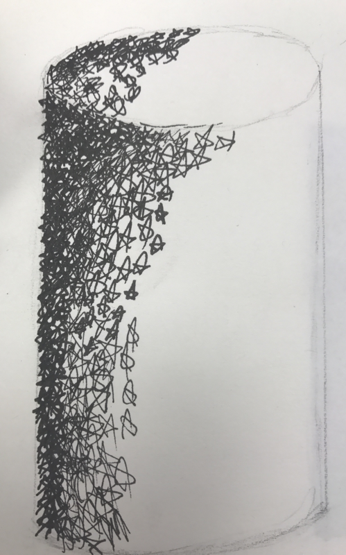
Pen and ink shapes
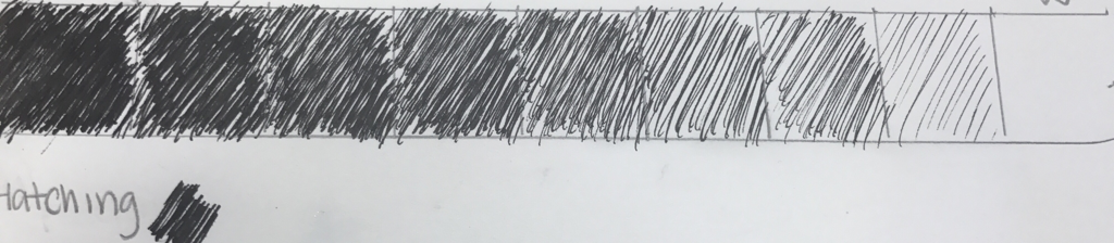
my hatching scale
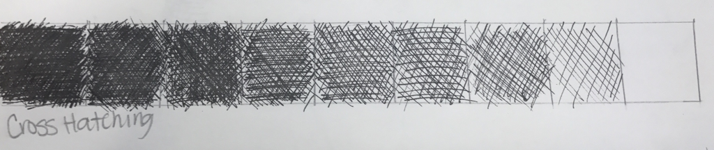
Cross hatching scale
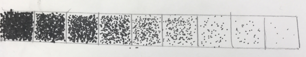
Stipling scale
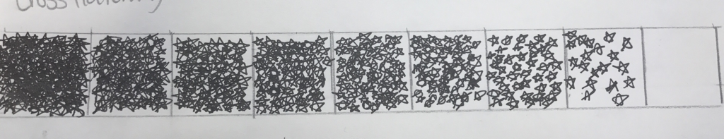
inventive scale
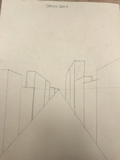
Perspective drawings
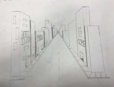
This is my 1-point
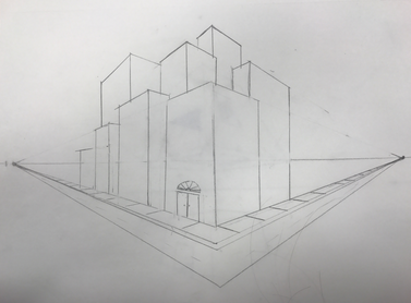
This is my 2-point
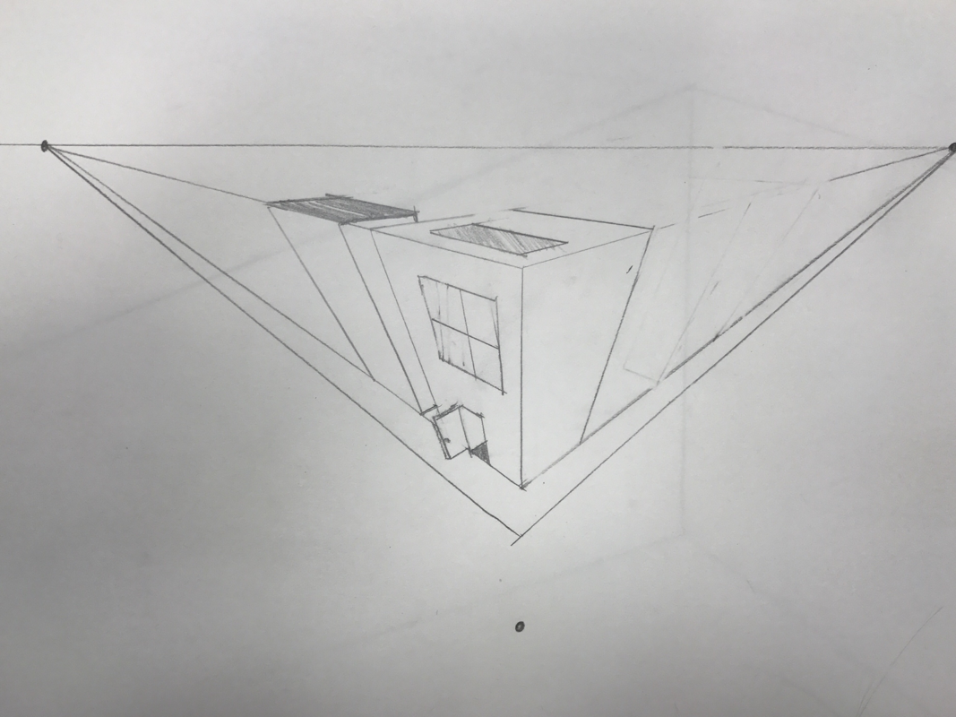
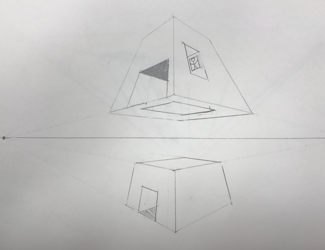
These are my 3-point
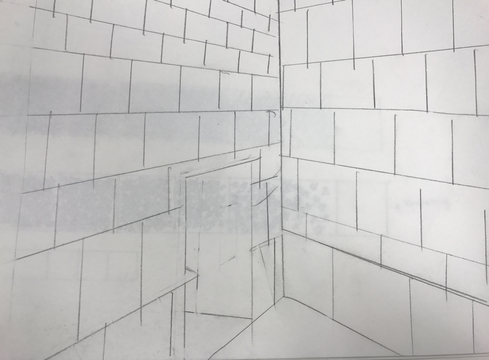
Room drawing